In today lesson we have gotten a special trip which is visiting the Sainsbury centre for visual art. “This is the centre located in Norwich which is one of the most outstanding university art galleries ,also the national centre for study and presenting art.”(scva.ac.uk)There were holding 3 exhibition inside which is the Sainsbury family collection,Fiji-Art and Life in Pacific and the Masters of Japanese photography.I have watch the exhibition of he Sainsbury family collection,Fiji-Art and Life in Pacific it is really an amazing opportunity or us to have such useful to do some research of art and cultural. Also I think this is very useful for my project which is about pubic exhibition.


“I think it has gotten a fantastic building which is designed by Norman Foster during 1974 to 1976. It was first open in 1978 which located in the edge of campus which near to the east-west site by the River Yare. “(scva.ac.uk)It has gotten a beautiful design of combining glass and aluminum . “Personally I really loved the spacing inside as it made the audience feel relax.It may because these building is designed in open spacing neither than the tradition divisions we can find in museums. “(scva.ac.uk) I loved the combination of glass and the metal use as this combination bring more nature light into the building and minimize the pressure brought by the metal material .I think this building is inspiring to my new project.It is about the public exhibition .I am going to do the showcase in our king street window.Therefore i have learn a lot from this building about the placement of my onward exhibition.Personally,I love the relaxing atmosphere brought by the well use of spacing and light environment inside the building which remain me to think about my own exhibition area. I found that it will be vital to found out how will the environment and lighting reacted to my art piece and what kind of feel will it show.
I have choose 6 exhibit which have interested me and really inspired to my onward project.


Little prince , John Davies,1972-1973
This is my favorite one of the whole collection here.It is because of the prefect texture of skin and wonderful colouring skill of human face. To be honest, it is a bit creepy and extremely attractive to place only a reality head sculpture in an independent space which just like minimize the other spacing area and catch our attention on it. It is interesting that there are a mask cover on the skin with a rough texture. In my point of view, it is just like remaining to the audience this is only the sculpture neither a real one and also brought an idea of hiding identity and how he look. Additionally this the rough mask have a very different texture to the other surface of sculpture . It is around eyes ,so it made that area pop out which create an interesting visual effect. I have create a shadow to hiding eyes but pop out that area at the same time which is contradiction which created the interest and made me force on his eyes which is look very reality too.This is a piece full of tension as there are a lot of contradiction part which created contrast and this is the reason way it is my favourite exhibit in the centre. As well as this it has inspired me about the importance of creating contrast and tension in my outcome therefore it will become attractive. Also it inspired me about the idea of reality which is made an extremely real outcome may look good too as nowadays art have become more abstract. Reality maybe an element to help my piece become more attractive.


Head of Gerda Boehm ,Frank Auerbach,1964
This is the other one I adored.Artist have created incredible use of color pigment in this painting.He created a face by using thick layer of colour which look like cream when the audiences stand closely.It is abstract when we stand really close to the painting but when we stand a bit farther we can clear saw the face. This have create tension which is really amazing . In addition it has shown artist great controls of colour pigment as he has created the beautiful detail by using the texture of pigment but also the from and sharp of the human face.As well as this it has show painting in a new idea as it can be a bit 3d too neither than only flat. It inspired me an idea of make something new based on the traditional media or method. As the traditional media or method that audiences know and get use to .Doing something new on it can bring freshness to the audience and made them have a good experience with modern art.


Little dancer aged fourteen ,Edgar Degas ,1880-1881
This the piece which I think it is interesting as the combination of the idea of bronze sculpture and fabric eye-catching. Artist has done a great job on dealing with the fabric material which make it look old and become unified to the bronze sculpture. I love this sculpture is because I think it has the classic art in an elegant method which is using the traditional sculpture material which is the bronze and smartly combine with the fabric which have brought a superb outlook of the ballet dress and also brought a historic feeling. These piece have remain the used of material which I can try to explore different material and combine them together and find out how did they reacted to each other.
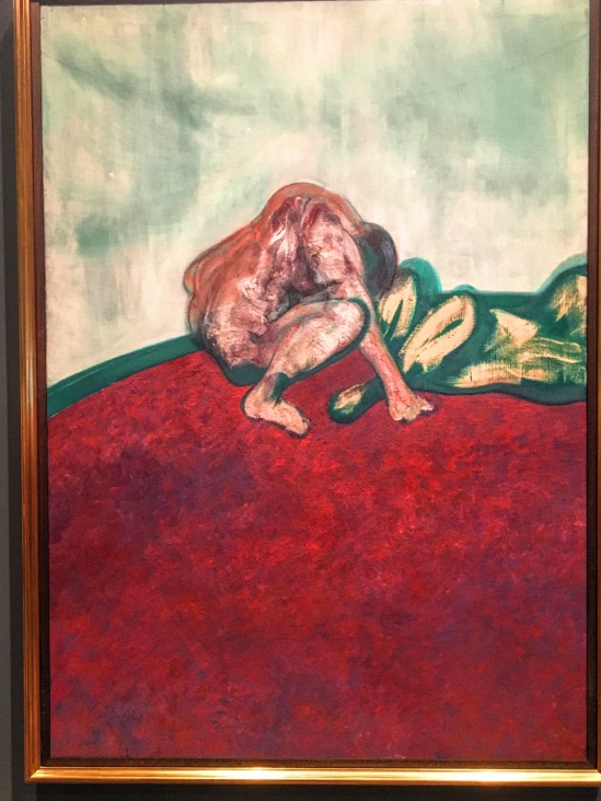
In this painting , it showed the admirable way to present human body form and the colour. In the painting , artist has mainly used 2 tone which is red and green. They were the contrast colour which can easily create a huge tension and made the painting become superb attractive. Artist has use a lot of red in the background and used brushstroke to create the fluffy texture of carpet and then use the mixture of white and green color to do the wall and separate them and the human body by using a thick green line. I think it is very smart to just using simple colour to created an attractive painting. And it is also an excellent idea to just red more in the painting as it is the primary colour which will have the higher colour value than green which men it will be more attractive to paint a lager area in red either than using green. Other than this red is also the warm colour, therefore it will bring a more comfortable feeling than using green colour.
About the human body , artist have only done one human body in detail by using the imaginary colour which is mainly using red to do the shadow and the most darkest part is using green. This colour use have make the painting become simpler and because of the contrast colour it has made this figure become more eye-catching. About human body art just use 2 colour in a very simple way to create the idea of human which is using green to be the background of the human body and then just using simple line to created the structure of the body.I think this way is just brilliant as it has simplify created the idea of human body at the same time made the more detail drawn figure become pop out in the painting.
This painting inspired me about colour. How can I use colour to create an attractive exhibit in my showcase also the colour relation and feeling brought by colour. This maybe the importance part to explore during my process of my own exhibit.
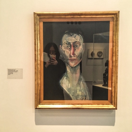
In this painting, I really love the colour use of the portrait . These is the more traditional portrait which is based on the black colour background. the lighter skin colour really look good with the contrast created. artist was using imaginary colour in these painting.The brushstroke have totally adored me as it look rough , a bit massive but full of artist personal style. It look amazing and strong show artist in this painting by using brushstroke. This painting inspired me about style .About my exhibition item , am I going to create a stylish painting or outcome ? In my perspective, this is an important idea to think about. It is because these maybe my first official exhibition. Therefore this will be the important question to think about as it may affect my onward style and career .
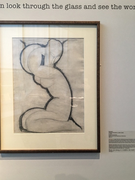
This is my favourite human body figure in the whole exhibition . As it is in the abstract form with curly line which have shown the signification character of female which is the soft body.Other than this , artist has only used mostly line drawing and a little bit tone to create this figure.As will as this it has used the thickness of line to stronger the whole image.This drawing have inspired me to think about the importance of showing the characteristic and line.
Reference
Scva.ac.uk. (2016). The Sainsbury Centre for Visual Arts. [online] Available at: http://scva.ac.uk [Accessed 15 Nov. 2016].
